Stelrix: Spend without selling
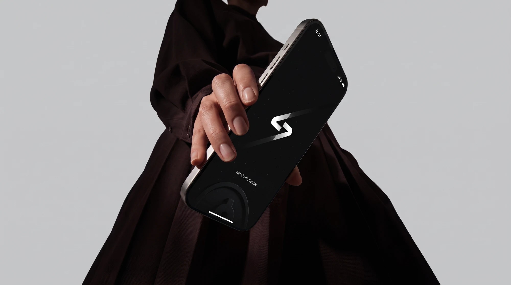
Stelrix is the first investment-backed credit card: your limit moves with your portfolio, so you can spend without selling. I designed the brand, the metal and plastic cards and the iOS app as one system.
- Year
- 2025
- Role
- Chief Design Officer
- Platform
- iOS app
- Status
- Waitlist live
Overview
Investors with real portfolios still get treated like strangers by their credit card. To get cash they sell, which means tax, lost compounding and a broken plan. Stelrix lets them spend against what they own instead, with a limit that reprices live as the market moves.
I was Chief Design Officer: the visual identity, the metal and plastic cards and the iOS app, all designed as one system.
Where it started
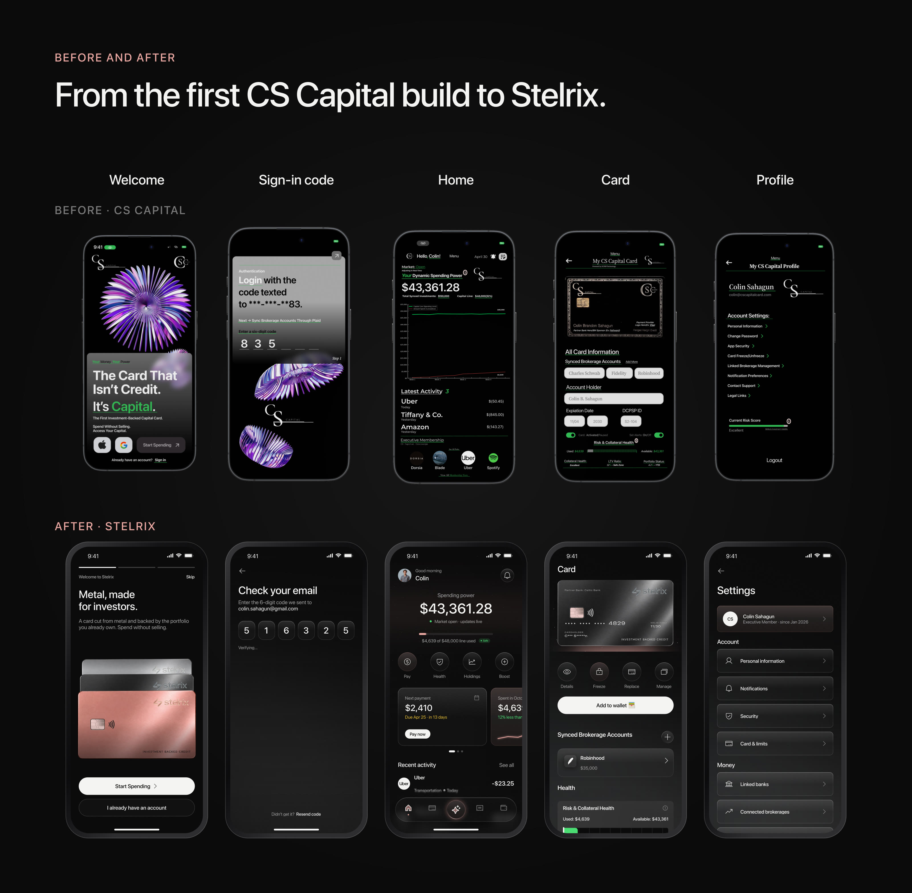
Stelrix began as CS Capital. The first build proved the idea but not the trust: neon green on black, purple 3D art, a serif and a sans on the same screen, and controls that changed shape from one page to the next.
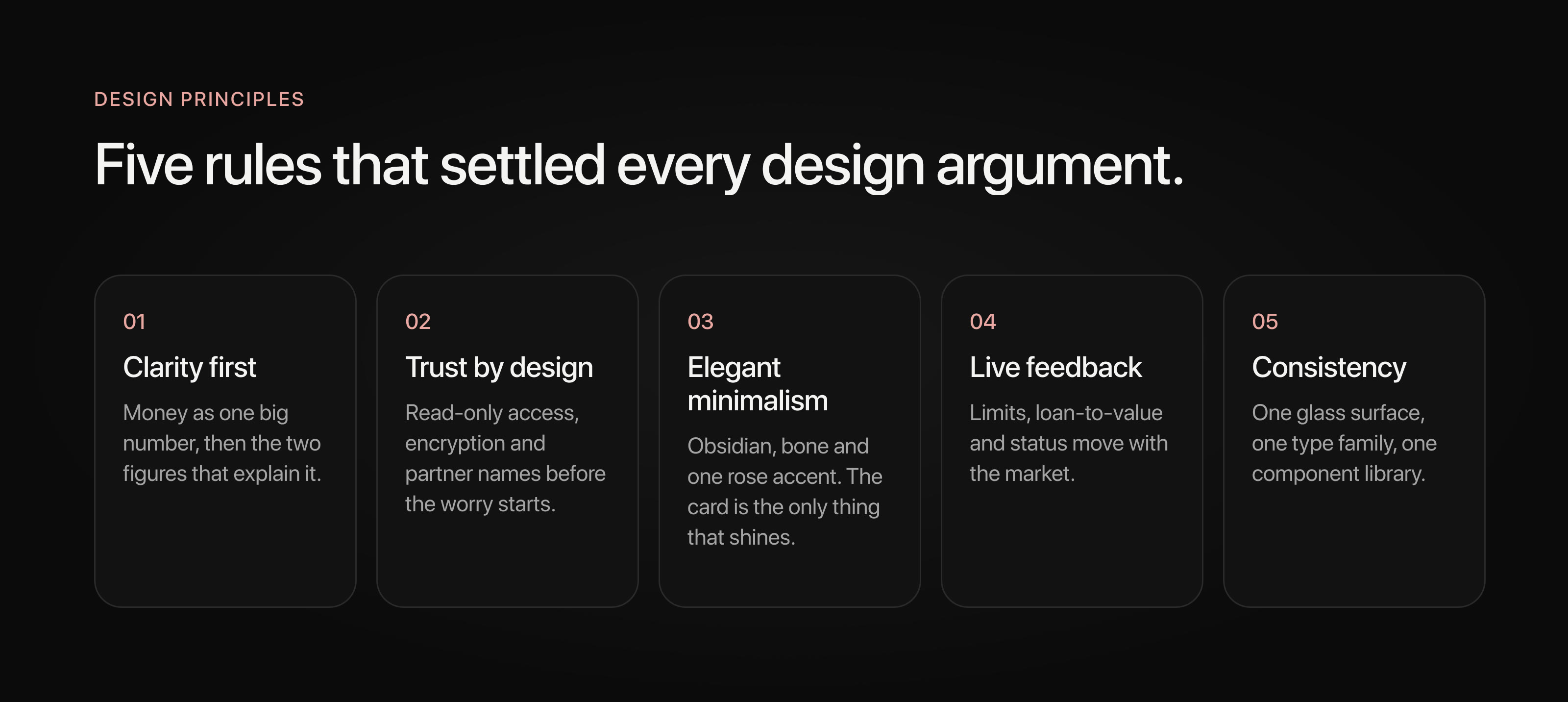
The redesign kept the product logic and rebuilt everything around it: a new name and mark, one rose accent taken from the metal card, SF Pro throughout, glass surfaces, and one component library behind every screen.
The problem
There were three ways to turn investments into spending money, and none of them worked for a regular self-directed investor. Selling triggers tax and kills compounding. Margin loans and SBLOCs are built for traders and private-banking clients, with opaque terms and margin calls. A normal credit card ignores the portfolio entirely and judges you on a FICO score.
Stelrix's answer is a card secured by the portfolio itself. The design problem was trust: making "credit backed by your investments" feel safe, clear and calm, especially on the day the market drops.
Every gain gets taxed, and the money stops compounding.
Opaque terms, margin calls and private-banking minimums.
Everything you own is invisible. A FICO score decides.
A card secured by your portfolio. The limit moves with the market, and nothing gets sold.
Process
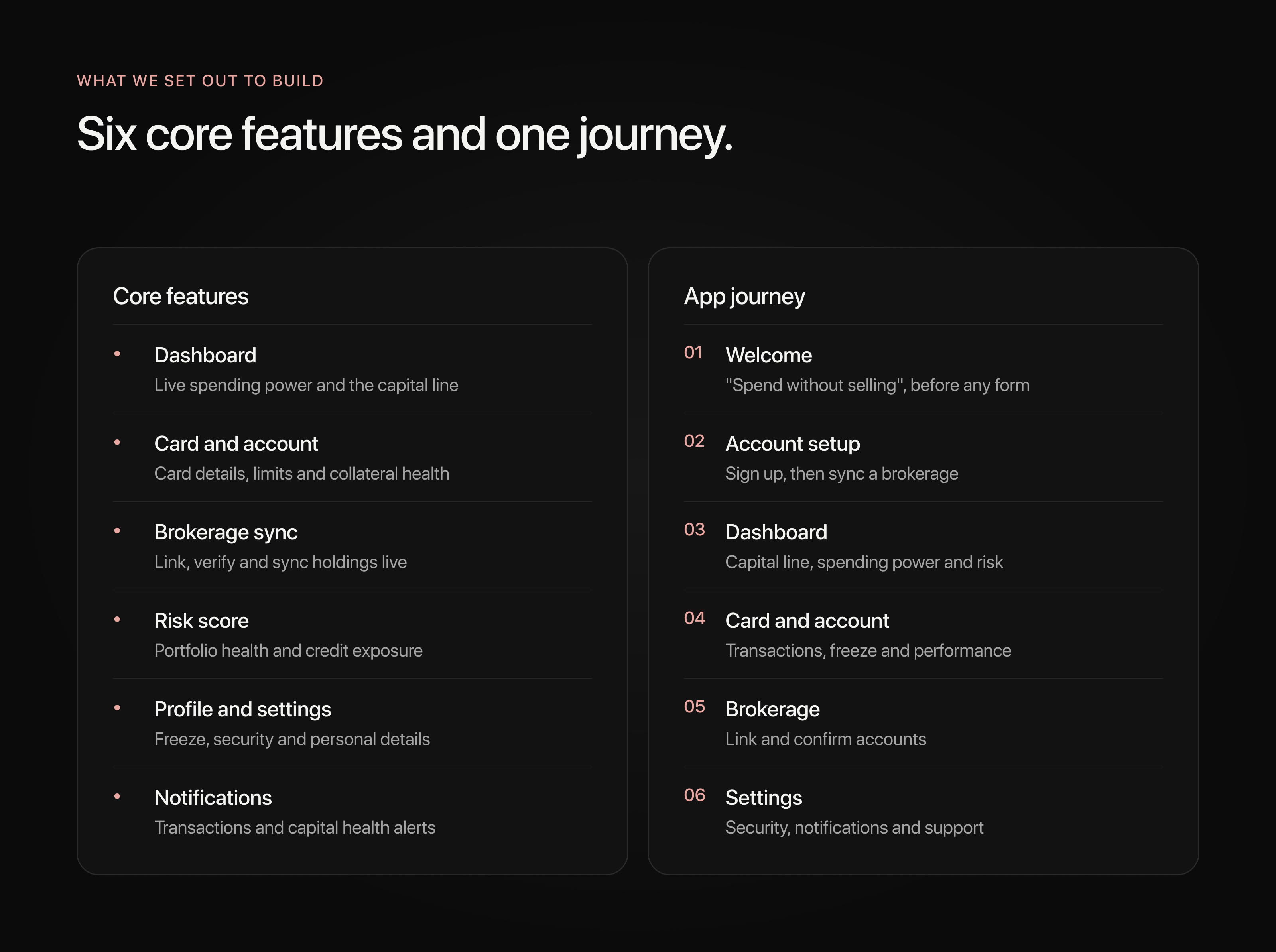
I benchmarked Brex, Amex, Rho and Revolut for premium feel and trust signals, tested prototypes of account syncing and collateral, and ran a heuristic review of existing fintech flows.
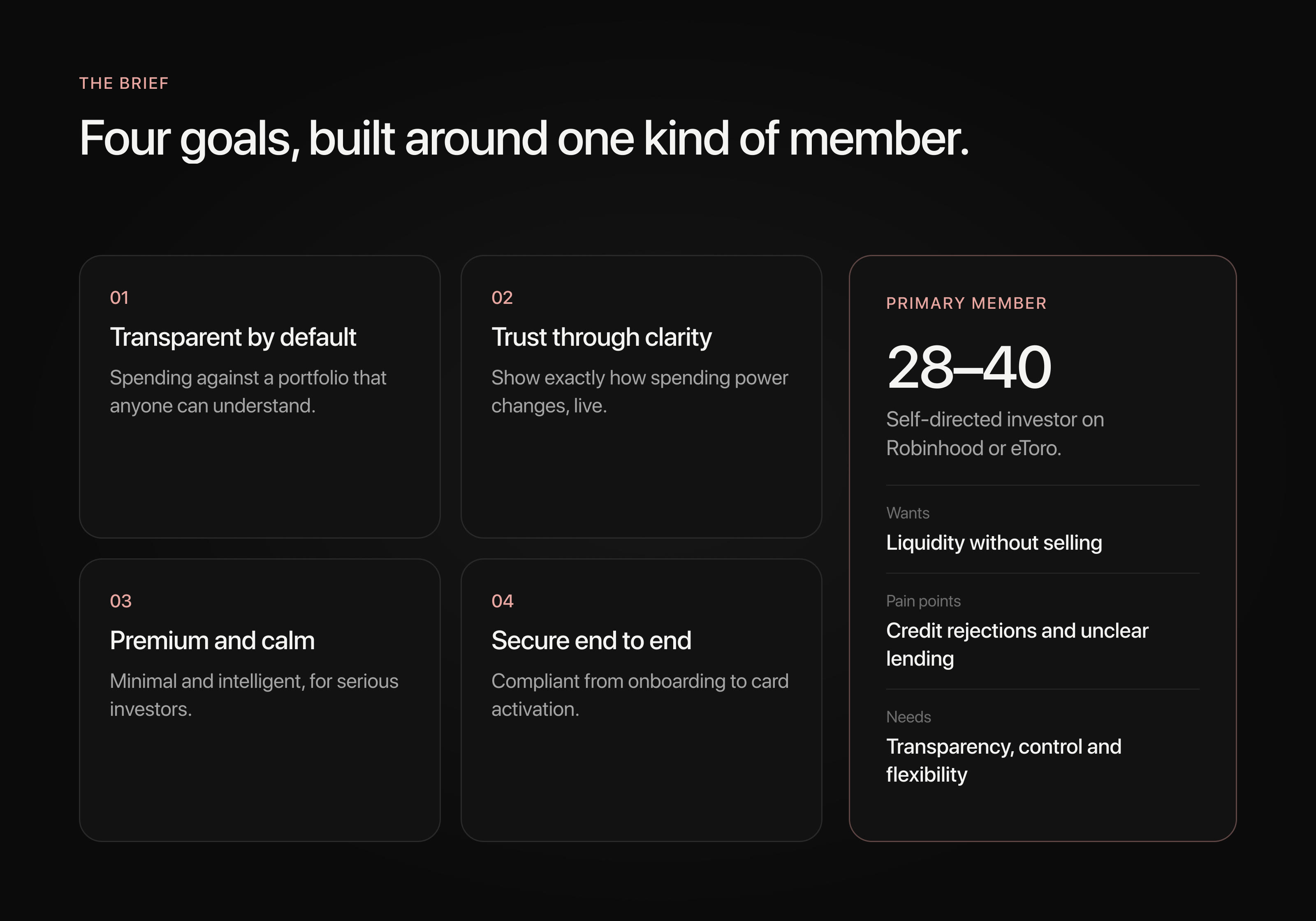
The main user is a self-directed investor, 28 to 40, on Robinhood or eToro. They want liquidity without selling, they've been burned by credit rejections and unclear lending, and above all they want to know what's happening and why. Five findings shaped the product.
Key decisions
A limit you can watch move
The credit line isn't fixed. It's priced from the portfolio, so the app shows that pricing working instead of hiding it behind a spinner: market data, portfolio risk and volatility go in, buying power and APR come out.
Designing for the bad day
Research kept coming back to one fear: what happens to my assets when the market falls? So market moves got their own flow. Every alert leads with the new number, then reassurance, then exactly one thing to do.
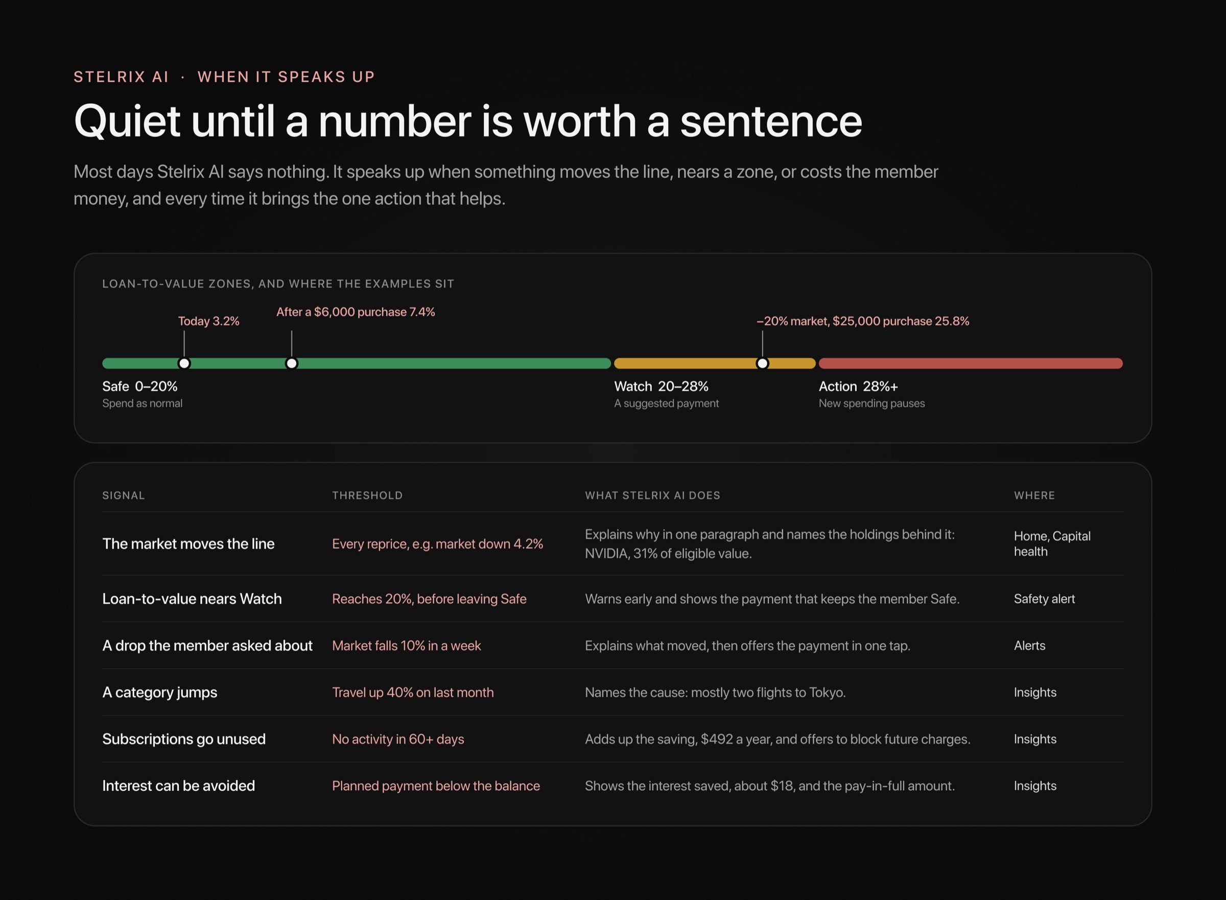
Capital Health turns loan-to-value into three plain zones: Safe, Watch and Action. A market buffer shows how far the portfolio could fall before anything changes, and in Watch the app shows the exact payment that gets members back to Safe, instead of a margin call.
An assistant that answers with your numbers
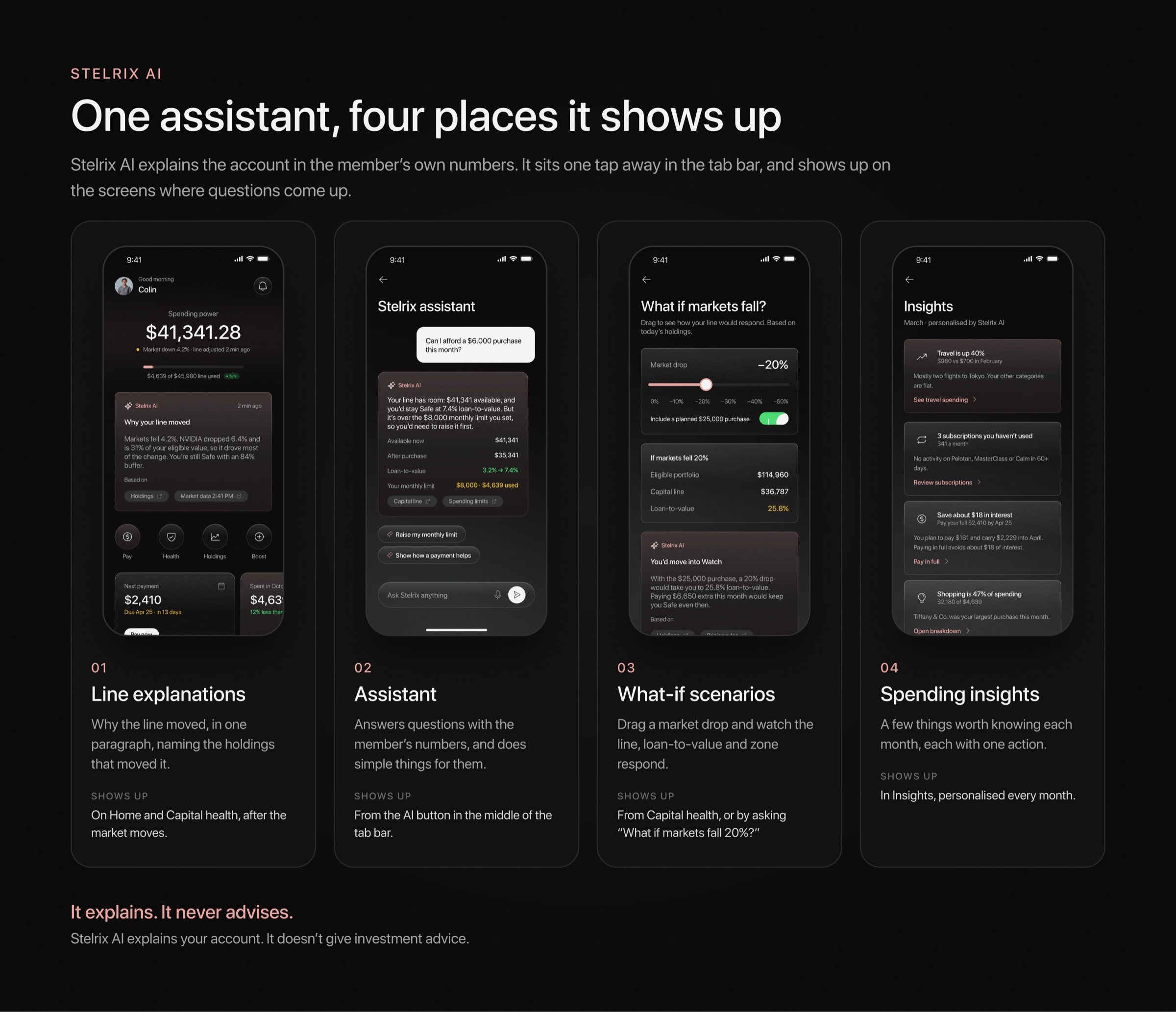
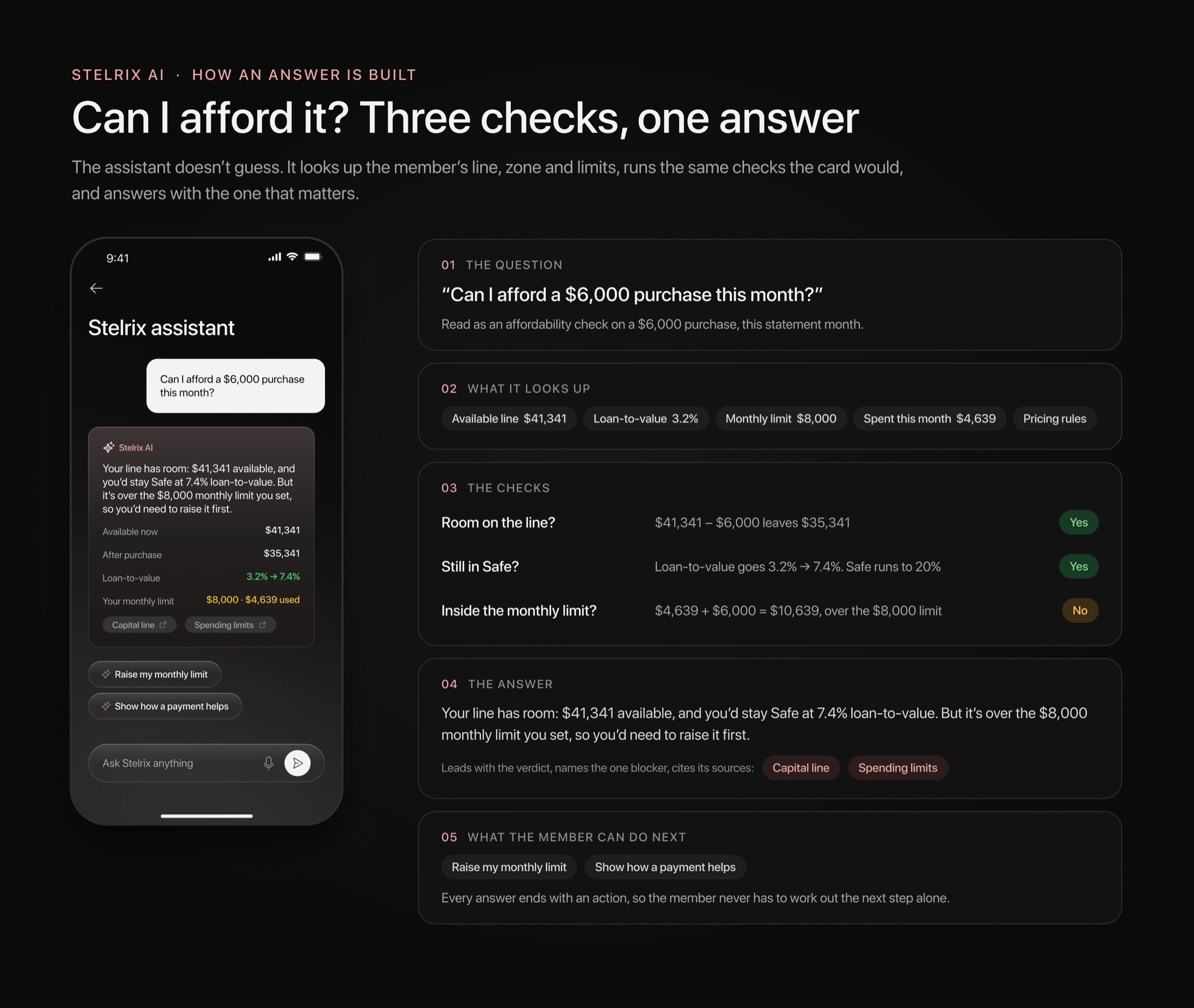
Stelrix AI sits in the middle of the tab bar. Ask whether you can afford something and it answers with your available line, what's left after the purchase and where your loan-to-value lands. Every answer links back to the screen it came from.
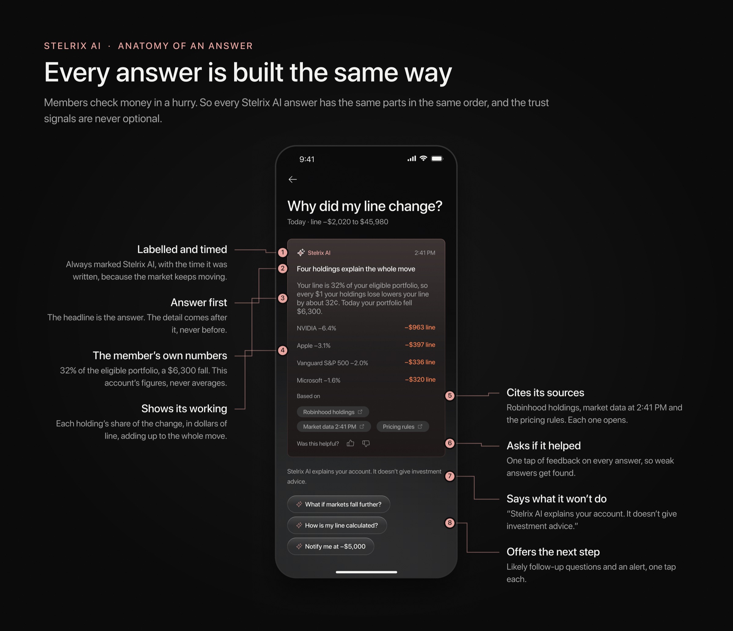
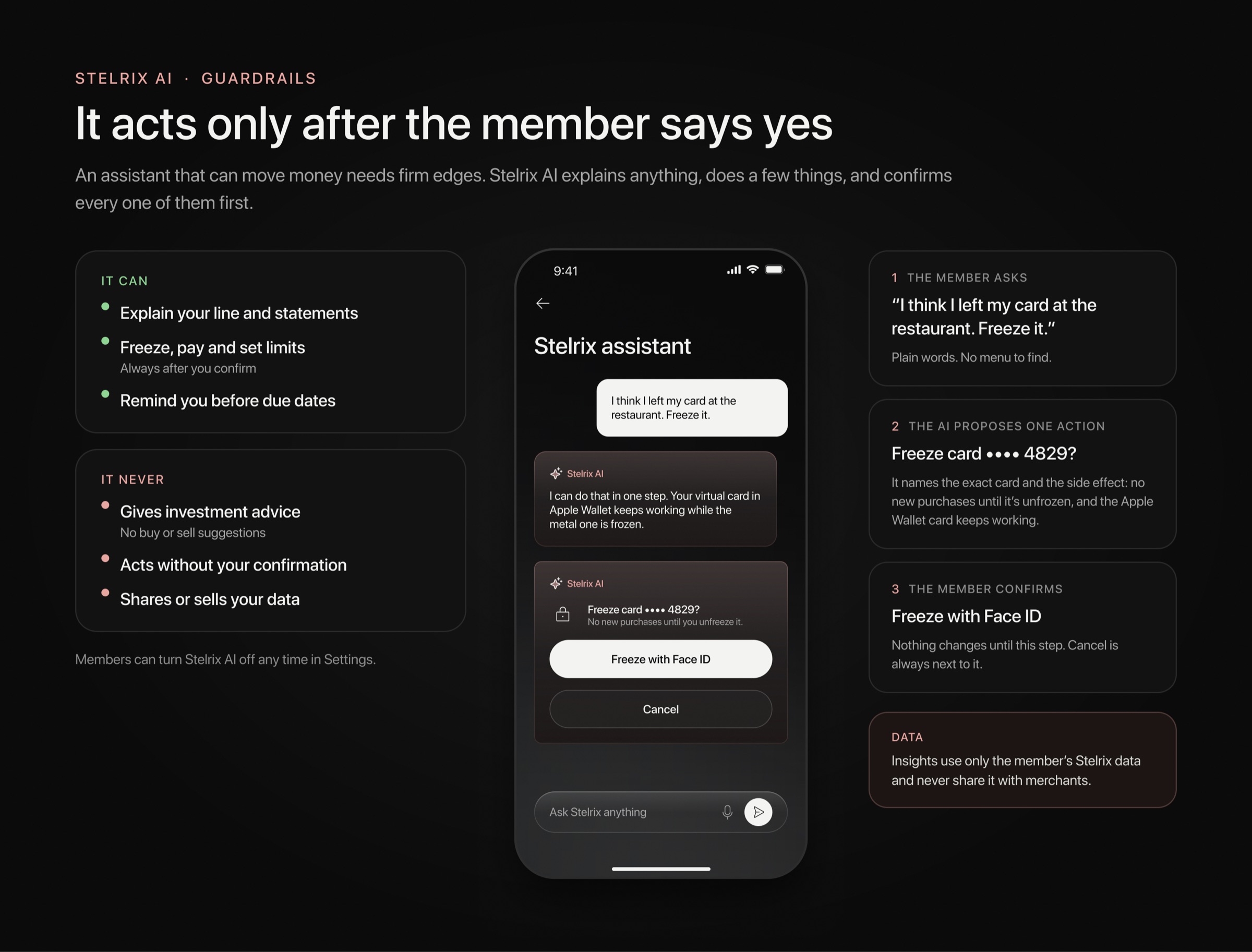
Behind that screen is one rule: it explains, it never advises. Every answer is built the same way. It looks up the member's own numbers, runs the checks, shows the working and says where each figure came from. It can propose an action, like freezing the card, but nothing happens until the member confirms with Face ID. And it stays quiet until a number moves enough to be worth a sentence.
A card worth holding
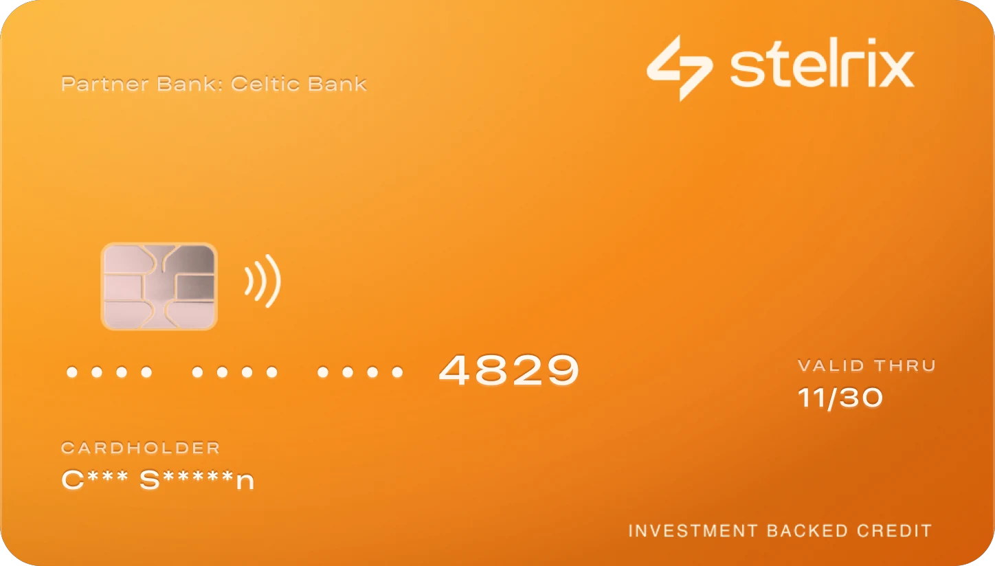
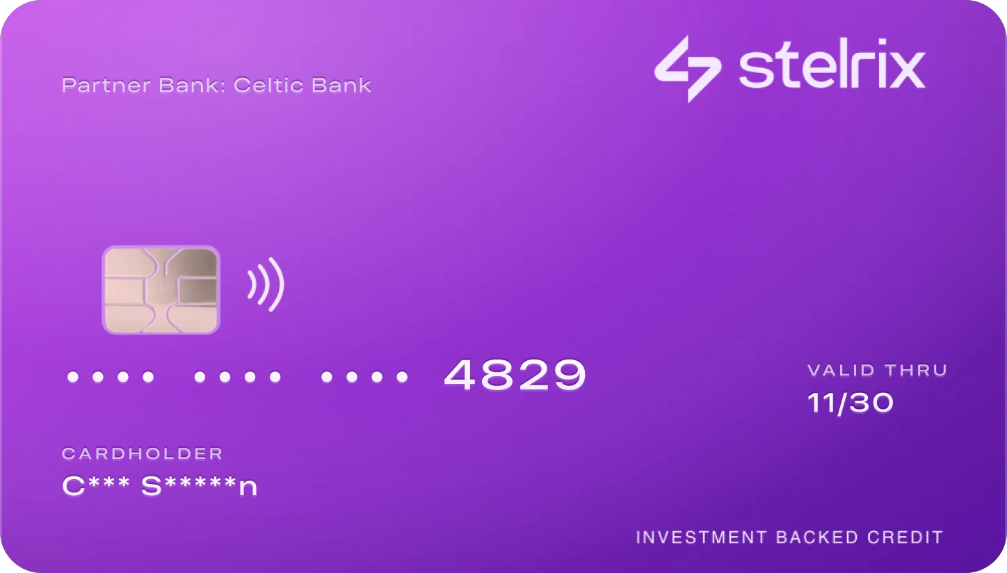
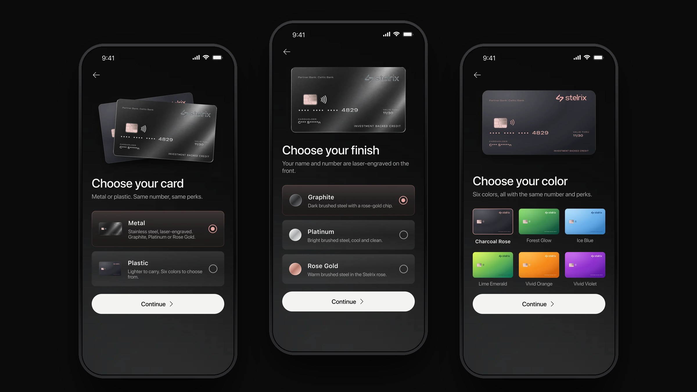
The card is the brand's only physical object, so it set the palette: rose gold, obsidian and bone. Members choose from three metals, laser-engraved, and six plastics, printed. Each keeps the same number, name, expiry and partner bank, set in the card's own wide type with an engraved finish.
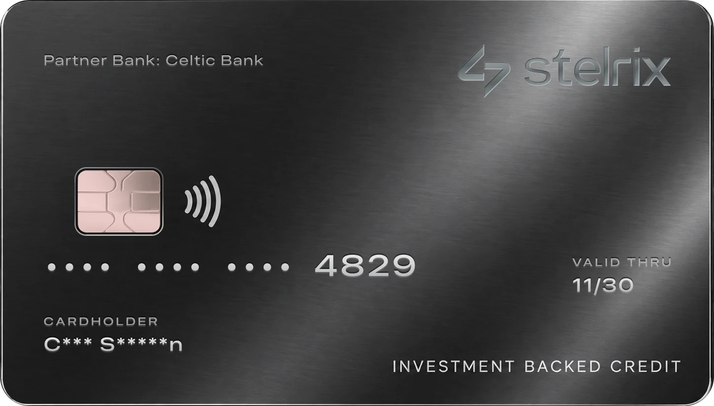
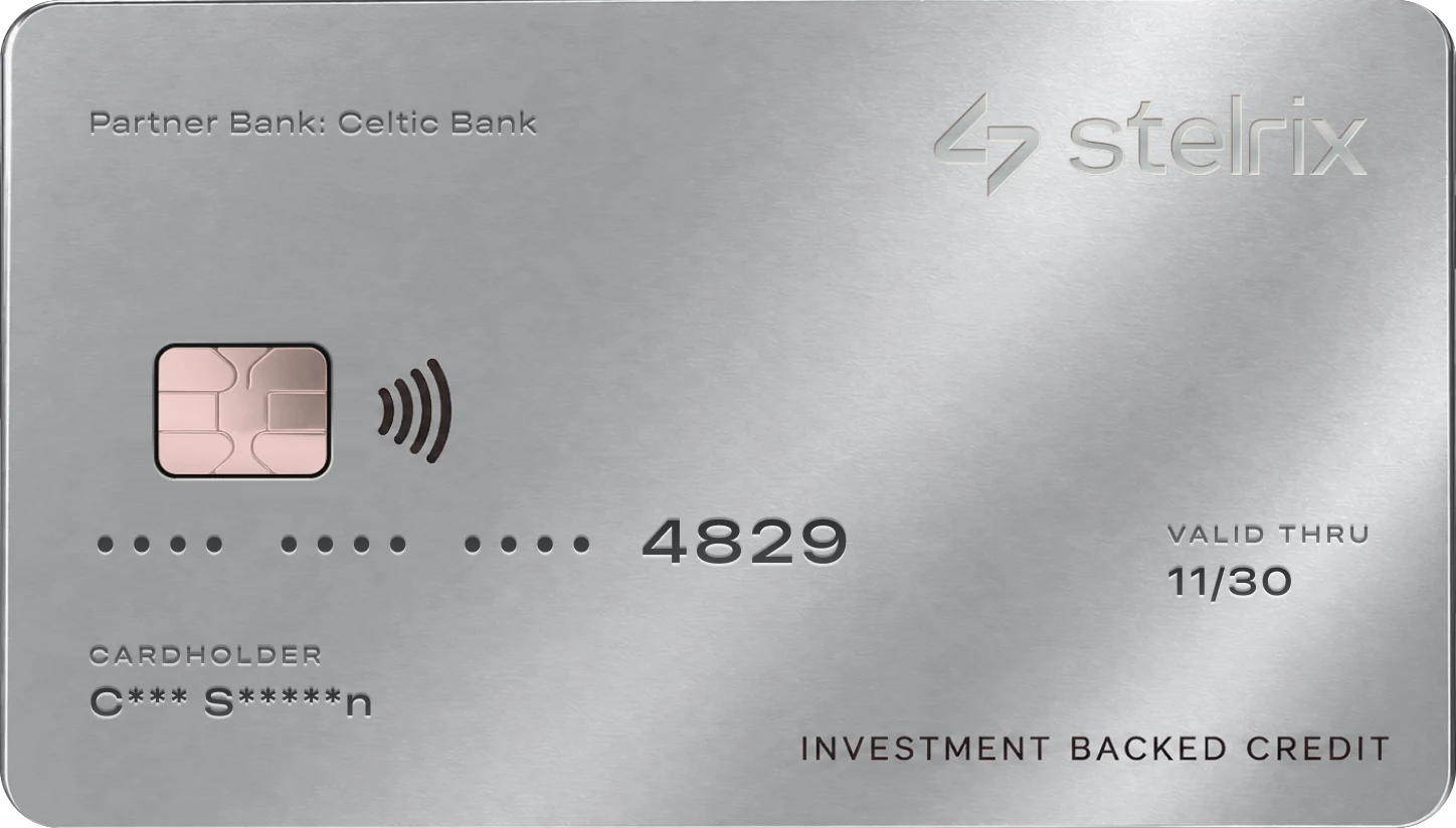
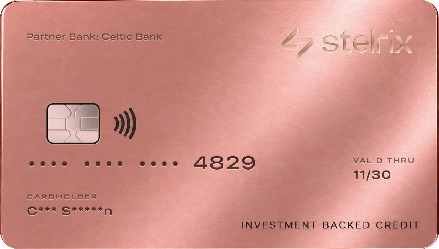
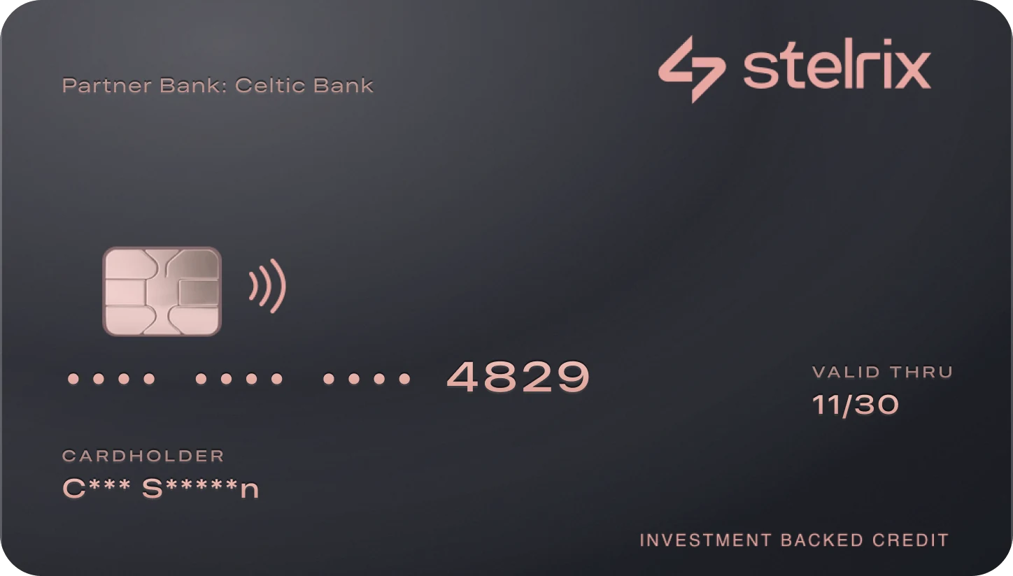
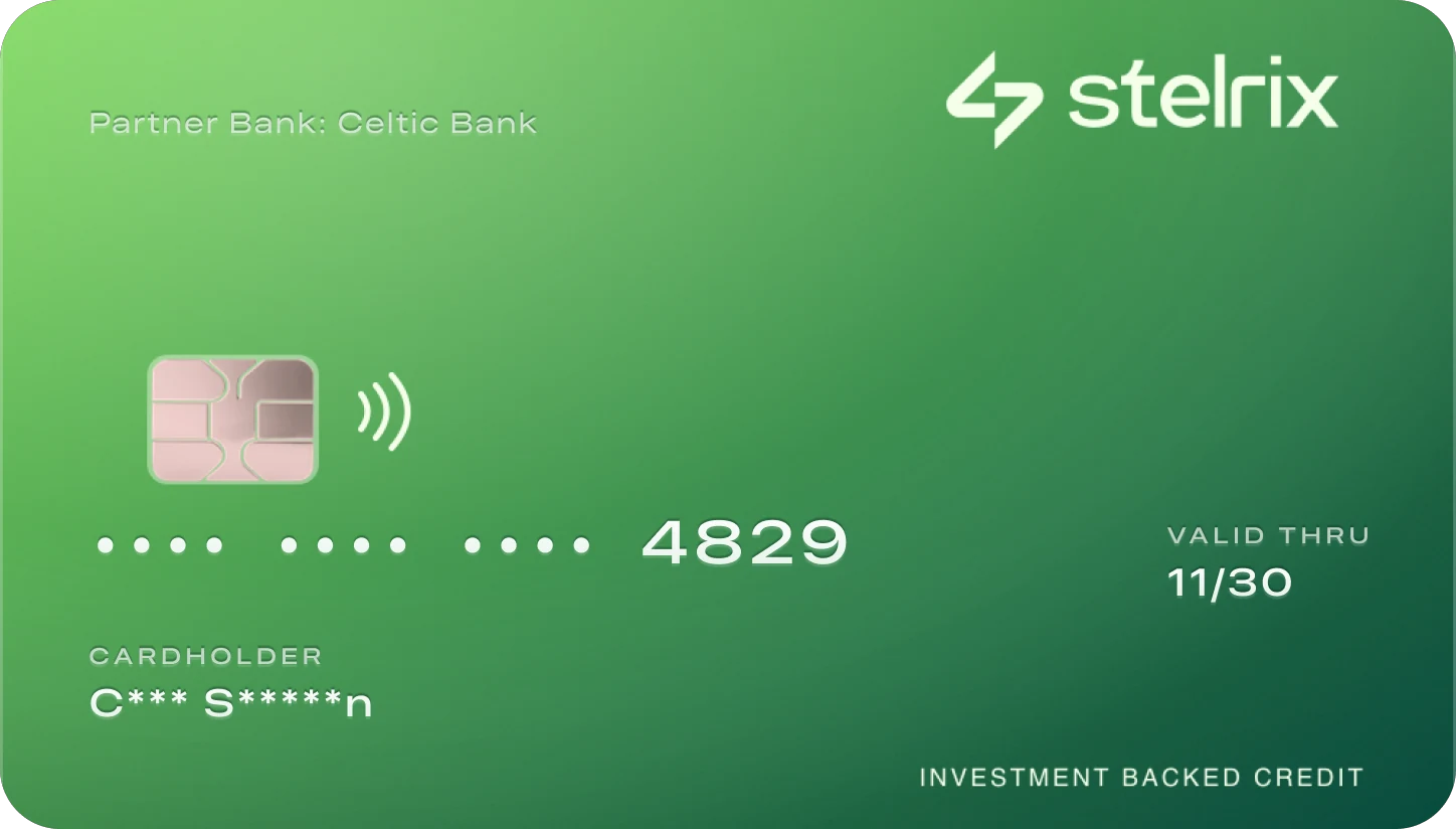
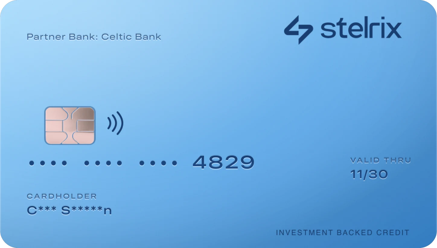
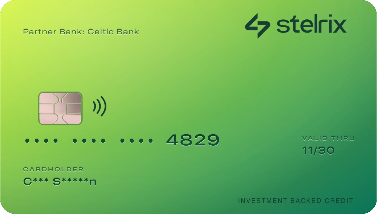
Graphite Metal
Metal or plastic.
Same number, same perks.
The choice comes first, then the finish or color, previewed on the card that will arrive. The virtual card works from the first minute, so nobody waits to spend.
- Metal or plastic, one tap
- Finish or color, shown on the real card
- The same card number, so subscriptions keep working
- Tracking, activation by code or tap, then Apple Wallet
Onboarding that explains before it asks
The first screen says what Stelrix is in one line, before any form: not credit, capital. Three short stories follow, each with its own animation and a progress bar timed to it.
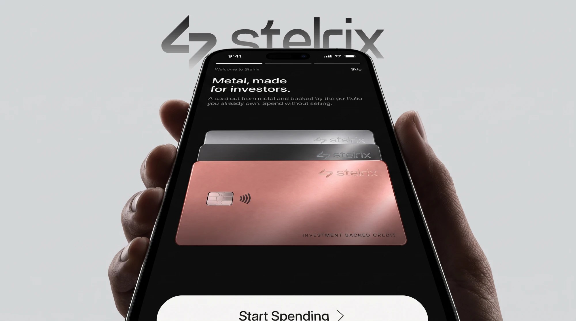
- 01One line, before any formThe splash says what Stelrix is: not credit, capital. The logo lands, then the line, then the coin.
- 02Metal, made for investorsThe card comes first, because it's the thing members will hold.
- 03Priced live, by your portfolioMarket data, risk and volatility go in. Buying power and APR come out.
- 04Your assets stay putRead-only access. Stelrix can see holdings, but never trade, sell or withdraw.
Everything else, designed
components in one library
81 tokens and 39 text styles. New flows are built from it, not redrawn.
flows
From the waitlist and identity checks to disputes, statements and closing an account.
Freeze in one tap. Unfreeze behind Face ID.
Speed when a card goes missing, security when someone else might be holding the phone.
Your rate follows your loan-to-value, not your credit score.
Bands are checked at market close and only change after three days, so one bad afternoon never moves your rate.
A reference number for everything.
Disputes get a four-step timeline. Autopay is set once, with three timing options.
Outcome
Stelrix launched with a waitlist at stelrix.com.
What I'd do next: test the Watch state with members who've lived through a real drawdown, and take the pricing screen through compliance before launch.
What's next
Working on something similar?
Let's talk.
If this project sounds close to what you need, I'd love to hear about it. I usually reply within a day.
